Five Keys To an Accessible Website
By Ann Sgarzi, Director of Marketing, Discovery Museum and Alicia Pritt, Managing Partner, Theory One Design
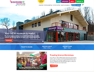
Discovery Museum partnered with Theory One Design to design and build a new, accessible website for the museum. Here is what we learned.
Theory One Design: We often hear from potential clients, “Accessibility is important to us” but it’s not often they can articulate a vision for accessibility in practice in the context of their mission. Discovery Museum was an exception. Their Open Door Connections program welcomes families with children with an ASD, are blind or experience low vision, or are deaf or hard of hearing, for free or deeply reduced cost, comprising 26% of their visitors in 2017.
When the museum engaged us to strategize, design and develop their website, they were in the midst of an $8.8M capital campaign to revitalize their facilities and make their campus building and exhibits accessible to the widest range of ages and abilities. Their challenge to us: Can our online home mirror the same commitment to accessibility as our physical home? We eagerly accepted knowing we had found a client who could partner with real commitment to the task.
Discovery Museum: Accessibility is a top priority for the Discovery Museum and we have taken significant steps to make our facilities welcome to all. We want the very first point of contact a potential visitor might have with the museum—be it onsite or online—to send the message that all are welcome here. Developing a website that would be accessible to those with physical, sensory, or cognitive functional limitations was an obvious priority for us.
Step 1: Make accessibility a goal from the beginning—not an add-on later
Discovery Museum: We knew we wanted an accessible website…but had no idea what that meant. There was concern about what an accessible site might look like—would accessibility for some create an encumbered user experience for others? We were delighted to learn instead that an accessible approach to website development provides for a clean site structure and enhanced usability for all!
We looked for a development partner who was comfortable with an accessibility-first approach to design and development; Theory One was the perfect partner to work with and learn from. With their help, we came to understand that it would not be possible to retrofit our existing site and hit our accessibility goals. Perhaps we could make some tweaks that would help, but we learned that much of what makes a site accessible is in the bones. Planning upfront for an accessible site let us do choose the right partner and to do it well.
Another benefit of up-front planning: the opportunity to partner with a grantmaker on funding. Sudbury Foundation has long supported the museum's accessibility initiatives, and appreciated and supported our goal of creating an accessible website. We were very grateful that the foundation generously helped underwrite this project.
Theory One Design: Getting half-way or three-quarters through a project and hearing a client say, "By the way, our website will be accessible, right?" can be frustrating for everyone. Retrofitting a half-completed site to meet accessibility standards isn’t fun and not always successful. Tackling this goal mid-stream can also have unpleasant implications on our clients' budgets. Having the opportunity to take an accessibility-first approach on this project was such a gift. It gave us a chance to put the right resources in place from the beginning and allowed us to consider every decision we made through the lens of our accessibility goals. The Museum was fortunate to receive grant money to support this project but additional funding is not a requirement to make a site accessible. Simply planning in advance can put this goal in reach for many clients.
Step 2: Know the standards—then exceed them
Discovery Museum: Through our participation in the Mass Cultural Council’s UP (Universal Participation) initiative, we were introduced to accessible design and WCAG (Web Content Accessibility Guidelines) 2.0, a set of success criteria and techniques for website accessibility maintained by WC3, the Web Accessibility Initiative. WCAG 2.0 lays out four high-level principles for accessible web content and user interface:
- Perceivable - Information and user interface components must be presentable to users in ways they can perceive.
- Operable - User interface components and navigation must be operable.
- Understandable - Information and the operation of user interface must be understandable.
- Robust - Content must be robust enough that it can be interpreted reliably by a wide variety of user agents, including assistive technologies.
The WCAG 2.0 checklist made it easy to identify up front which tasks were design and programming related and therefore Theory One Design’s responsibility, and which were content related and therefore our responsibility. Before the project started we had a clear understanding of what we’d need to do to achieve the level of accessibility we wanted, and we knew it was doable.
Theory One Design: Our firm committed a long time ago to follow best practices in design and development to facilitate basic website accessibility, whether or not a client requests or is aware of this. Discovery Museum was committed to exceeding those basic best practices and the WCAG 2.0 criteria provided us both a roadmap. Taking the time to educate them on how content, page design, and backend programming work together to create accessibility transformed the WCAG 2.0 checklist into an accessibility story we could co-write and narrate.
Step 3: Test, test, test with real users and with assistive technology
Discovery Museum: Most of us know by now that there are big differences when viewing a site on a phone vs. a tablet vs. a desktop, but through this project we learned there are many more ways our visitors could potentially experience our site. We were introduced to the often unseen world of assistive technology—products, equipment, and systems that enhance learning, working, and daily living for persons with disabilities. Some examples include magnifiers that make screen text larger for those with low vision; screen reader software that reads and describes aloud webpage content for a person with low vision or who is blind; roller balls and track pads for those with mobility issues who cannot use a standard mouse or keyboard; and speech input software and alternative input devices to allow people to interact with computers without using a keyboard.
It seemed logical that testing our site with assistive technology would be necessary, but how? And if we did test, could we address what was found in the testing process?
Theory One Design: Once the site was designed and developed enough to make testing feasible, we submitted the site to an accessibility review conducted by the Institute for Human Centered Design (IHCD). The IHCD’s User/Expert Lab* road tested the site with a user group using accommodations for a range of challenges, including but not limited to cognitive functional limitation, blindness, low vision, and mobility limitations. The conclusion of IHCD’s assessment was overwhelmingly positive but the value of inviting IHCD to the project was clearly seen in the list of suggestions their User/Experts provided. Their list generated a productive conversation with Discovery Museum about which suggestions they wished to implement according to their priorities and what their budget and schedule would allow. From there, together we crafted a plan to address their priority items.
(*A user/experts is defined by IHCD as “a person who has developed expertise by means of their lived experience in dealing with the challenges of the environment due to a physical, sensory, or cognitive functional limitation.”)
Discovery Museum: The IHCD prefaced their assessment by saying, “This was the most seamless User/Expert review we’ve done.” We were SO pleased!
In addition to the testing conducted by IHCD, we tested the site with employees, visitors, and our team of external Accessibility Advisors, which supports all of our accessibility work. These groups found the site easy to use and much improved from the old site, and also provided suggestions for improvement.
Step 4: Don’t leave it to the developers alone: content matters
Discovery Museum: Writing for accessibility—and, writing for the web in general—is not like writing a blog post, academic paper, letter, or news article. The writing must be simple, clear, and brief. Less is more. Long sentences, even if well-punctuated, can lose both the sighted user’s attention and the assisted-technology user who is having the site read aloud to them. While it is relatively easy for a sited user to assess the amount of content on a page, the relative importance of specific content within a page, and skip around to what interests them, the user employing a screen reader is listening without these content clues and flexibility. Using short, declarative sentences, just a couple sentences per paragraph, and very few paragraphs makes a webpage much easier for all users to digest.
Something else we learned: Avoid wording that presumes or implies ability. For example, we originally used this language on our Getting Here and Parking page: “Look for Bessie the dinosaur on our front lawn.” But a low-vision or blind visitor may not be able to be guided by this landmark, so we re-worded this to, “Bessie the dinosaur graces our front lawn.”
And then there is the content we generally don’t think about writing for: visual content. When a screen reader encounters a photo or a graphic on a webpage, it can read the descriptive text that accompanies it to let the user know what the image is conveying. If there is no descriptive text, your opportunity to enhance your written content with visual content is lost. We made it a priority for every image on our site to be described with the Alt-text field that accompanies it, which is the field read by screen readers. It was time consuming but so very worth it. We also closed-captioned and added PDF transcripts to all video content.
Theory One Design: Page design and backend programming alone does not make a site accessible, and having a client understand the role they play with respect to content ensured this project was a success. The content Discovery Museum delivered was clean, thoughtfully written and structured with accessibility goals in mind.
Step 5: Build a site you can maintain
Discovery Museum: The great news here: this happens naturally through the process! Our site is so well-architected that it is, honestly, a dream to maintain. Building a clean site from the bottom up, which is what accessibility requires, makes easy maintenance simply a result of your process, rather than an extra step to consider.
Summary
Discovery Museum: This project was well-structured and therefore enjoyable to work on, and the result is thoroughly rewarding. Theory One provided excellent project management tools, technical skills, and design perspective, and it was clear throughout the process that we had a shared vision for accessibility and usability that enabled success. The site is useable by users with all abilities and we believe it sends the message we’d hoped to send: all visitors are welcome at the Discovery Museum.
Discovery Museum is a hands-on museum for families that blends science, nature, and play.
The museum and its Discovery Woods accessible outdoor nature playscape and 550 sf treehouse blend the best of STEAM learning on a beautiful 4.5-acre campus abutting 180 acres of conservation land in Acton, MA, about 20 miles west of Boston. Originally founded in 1982 and expanded to two museums in 1987, early this year the museum reopened in a single, accessible building after a complete renovation and expansion.
Theory One Design is a multidisciplinary communications and visual design consultancy specializing in branding, web design and development, digital and print media, exhibit design and content development for nonprofit organizations.