NEMA 2018 Publication Award Winners
By Scarlett V. Hoey, Manager of Membership & Development, New England Museum Association
For 100 years, the New England Museum Association has served museums of all sizes and the people who work for them. This year, as we dug into our archives for the NEMA Centennial, we uncovered records of the Publication Awards going back to 1978! Originally the awards were started as a project by the NEMA Curators Committee, but now the competition is coordinated by the NEMA staff. Forty years since its initial launch, the Publication Awards competition continues in its tradition of showcasing the finest examples of publications in the field, and we thank all the museums that participated.
The judging for the 2018 Publication Awards took place on May 25 at the American Antiquarian Society in Worcester, Massachusetts. Special thanks to our host site, and to our judges -- Ryan Canuel, Co-Founder and CEO, Petricore; Kayla Hopper, Outreach Coordinator, and Jaclyn Penny, Design Librarian, American Antiquarian Society – who generously gave their time and expertise.
May 25, 3:16 PM
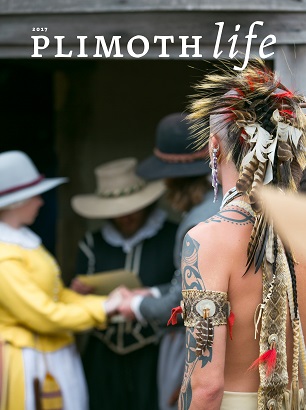
A rainbow of post-it notes cover the laptop and publications that spread-out across the table in the historic Goddard-Daniels House. The judges have just spent the last six hours analyzing, examining, and evaluating 144 submitted publications from 51 institutions. On the table are the 11 First Place winners, one from each category, including both physical and digital museum publications. The judges must now pick one to receive Best-In-Show. After a hearty discussion and careful deliberation, it is a unanimous decision to award Best in Show to Plimoth Life from Plimoth Plantation, First Place in the Newsletters & Magazines category.


On Publications and Design
In all categories, the judges were impressed with the overall quality of the entries as well as the range of institutions and programming that they represent. The judges thought the winning submissions did an excellent job engaging viewers through typography and visual design. They found many publications used color as more of a visual wash or graphic ombre, rather than a color block. Overall the judges thought the balance of text to image and clarity of communication helped to determine the success of a publication.
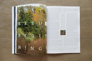
While the judges shared their thoughts on many of the submissions, they described Plimoth Life as “thoughtful” and “visually interesting without being overwhelming.” The judges enjoyed how the layout used “historical details in the design” and found it “luscious” (the exact word used by the judges last year for Best in Show!). The best Newsletters & Magazines had excellent readability and surprised the judges with splashes of color or comics in the middle.
The Annual Reports category and Annual Fund, Capital Campaign, & Other Development Materials category kept the judges busy. The Montshire Museum of Science Annual Report did an excellent job visually “telling a story and the 'down and dirty financials’” while the Boston Children’s Museum enticed the viewer with We Asked, which provided stories from parents throughout the report. The judges thought that the pull-quotes were used to great effect in the USS Constitution Museum’s report. Through linking text and balancing color the Museum of Science Museum Lookbook harmoniously united a development booklet within a larger folder; and the Bruce Museum Capital Campaign: "The Campaign for the Bruce Museum" attracted the judges with the minimalistic text and dramatic images. For these two categories, although the objects can often be ephemeral, the judges felt like many could be held on to because of their beauty.
While it is true you can’t judge a publication by its cover, the judges found many Exhibition Catalogues used striking cover colors to draw in readers. From the Harvard Art Museum’s azure-cyan covered An Album of Artists' Drawings from Qajar Iran to the lime font on Makers' Marks: Art, Craft and the Fiber of Change from the Nichols House Museum, the winning exhibit catalogues took risks and were bold on both the inside and out. Small-Great Objects: Anni and Josef Albers in the Americas from the Yale University Art Gallery had a white cover with sky-blue text balancing out black-and-white portraits of the artists, leading one judge to say “the typeface is great, and the combination of the black-and-white and color plates inside is excellent.” Invisible Citings from the Addison Gallery of American Art made a book cover unlike any other submission in recent history, where the catalogue was wrapped in a box made to look like an object in the exhibit.

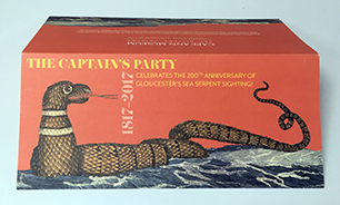
(Cape Ann Museum, The Captain's Party)
In addition to bold color choices, many publications used object details as a hook for attracting their viewer. On the cover of All Quiet on the Rappahannock: The Civil War Letters of Lt. Peter Hunt from the John Hunt Museum, East Providence Historical Society, there is a handwritten letter in the background from Lt. Peter Hunt, and the Concord Museum used a detail of handwritten cursive in their invitation for This Ever New Self: Thoreau and His Journal. The Cape Ann Museum utilized a sea dragon engraving for their invitation to The Captain's Party, while the Isabella Stewart Gardner Museum’s Close Up: Piermatteo D'Amelia's Annunciation cleverly used the “O” in the title to magnify the detail in the painting, the intimate focus of the book. Collection details were highlighted throughout many of the publications this year.
Two separate museums won for their use and design of stickers at the museum. In the Educational Publications, Materials & Kits Category, My Sticker Book Guide to the Florence Griswold Museum was an engaging passport style booklet encouraging childhood visits through the storytelling, drawing component, and sticker placement in the booklet. From childhood sticker book to adults’ sticker programs, the William Benton Museum of Art, University of Connecticut, organized a Laptop Art Sticker Program which encouraged students to collect laptop stickers of the latest exhibits while activating their free student membership. Perhaps no matter your age, stickers are a bit like Pokémon, “you got catch ‘em all.”
Our NEMA institutional members produce incredible publications and the judges had difficult choices to make. A sincere thank you to all the museums, designers, artists, staff, trustees, volunteers, students, and people who took the chance to participate in the 2018 Publication Awards competition. Thank you for all your hard work! Submissions for 2019 will open late-winter 2019. In the meantime, be inspired by the 2018 competition winners. You can view the list of winners online here or view the publications in person this fall at the 100th Annual NEMA conference in Stamford, CT, this November 7 -9, 2018.