
NEMA Publications Awards 2019
By Erin Wederbrook Yuskaitis, Administrative Assistant, New England Museum Association
The library at the Museum of Russian Icons features floor to ceiling windows and a gorgeous view of Clinton. Bookshelves with scholarship on art, culture, and global iconography line the walls. Sliding ladders perch on either end of the room waiting for an eager learner to climb up and pick a book from the very top shelf. This lovely setting served as the location for this year’s NEMA 2019 Publication Awards judging process.
This year’s judges included Mary Delaney, Marketing Director of the Museum of Russian Icons; John Hayes-Nikas, adjunct professor of art at Clark University; and Marya Van’t Hul, independent museum professional and former curator at Natick Historical Society. Coming with different perspectives on aesthetics based on their respective fields, the three judges complemented each other well. They noticed details as fine as book stitching, font choice, paper weight and texture, and page edges. They delighted in the use of bright colors, marveled at the stunning beauty of artwork featured, and commented on the relationship of the content to the design itself. They agreed, disagreed, laughed, snorted, and questioned each other.
To say that the process was thorough is an understatement. The judges took their responsibility to heart and carefully examined each entry, considering the criteria set forth by NEMA. Five hours after the judging process started, the winners were decided in all categories. Overall, the winning submissions from 13 categories impressed the judges with their sophisticated simplicity, vibrant colors, and clever design. This year the competition included 139 submissions from 53 museums. The full slate of winners can be found here.
Catch me up. What exactly are the NEMA Publication Awards again?
For several decades, NEMA has celebrated the finest examples of print and digital publications in the field through the Publications Awards. Now coordinated by NEMA’s Manager of Membership & Development Scarlett Hoey, the competition was originally coordinated by the NEMA Curators Committee. Now, almost forty years since its launch, the Pub Awards – as NEMA staff calls them – continue to honor the highest caliber of publication design work in our sector.
These awards celebrate the often unacknowledged outreach and communication work that museums do regularly through their publications. Good design easily and quickly connects museums with their communities in an aesthetically pleasing way. Essentially, good design looks fabulous, makes sense to the viewer, and communicates a clear message. When announcing this year’s winners, NEMA Executive Director Dan Yaeger said, “The winning institutions and the designers who worked with them should be commended for setting the bar so high.”
Sounds awesome. What do the judges look for, specifically?
NEMA asks the selected judges to make decisions for each category based on visual appeal and design, such as color choice, fonts and typography, layout and page spread, paper choice, and imagery. Judges also consider the effectiveness of each entry. Does it serve its communication purpose and reach its intended audience? Is it easy to read/use? Is it durable? Finally, judges look at the intellectual and creative work behind the entries. How does the design relate to the content? Does the entry have substance? How is innovation featured in this entry?
Discussions about the entries for each of the 13 categories ensues, and the judges whittle down the selections until they have the top three or four. NEMA then tasks them with selecting first, second, and third place winners. Judges have the option to select Honorable Mentions as well. Occasionally, joint wins take place for entries about which the judges feel equally passionate.
Of the 13 categories, the most competitive this year were Books and Exhibit Catalogues. The latter category was so competitive that the judges created a distinction between soft cover and hard cover catalogues to allow for more recognition of incredible design. Invitations were the next most competitive category with 23 submissions! A Best in Show is also selected, an entry the judges find so compelling, it is simply considered the highlight of the competition, regardless of category. This year’s Best in Show, George Shaw: A Corner of a Foreign Field, published by the Yale Center for British Art, captivated the judges from the moment they laid eyes on it. They gushed over its beautiful end plates, the successful use of a surprising color, the smart use of white space, the variety of images, the quality of the paper, and the color of the binding. In a word, stunning.
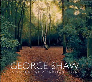
2019 Best in Show: George Shaw: A Corner of a Foreign Field, Yale Center for British Art
Ok, so tell me more about this year. What were the submissions like?
We saw some interesting trends this year. By far, the biggest trend was the use of vibrant colors with surprising contrasts. The Bakalar and Paine Galleries at Massachusetts College of Art and Design incorporated beautiful, bright colors as an integral part of the design for its Seeing the Elephant exhibition catalogue. The Museum of Fine Arts, Boston showcased its design chops with a gorgeous use of color fading in the Gender Bending Fashion invitation and supplemental material. The most prevalent color featured in this year’s submissions was bright orange, and the most successful uses of this color, according to the judges, could be seen in the Castle in the Clouds website and the previously mentioned book George Shaw: A Corner of a Foreign Field.
Simplicity dominated design this year. Many submissions did not include complicated layouts or decorative scripts, but instead intentionally avoided aesthetic excess. For example, Newport Restoration Foundation’s visitor brochure was a favorite among the judges for its uncomplicated elegance. In the same vein, the majority of designers opted for sans serif and big, bold fonts along with crisp, hard images. The Nantucket Historical Association’s book Collecting Nantucket: Artifacts from an Island Community featured a variety of stunning images of its collection. Those images were only accentuated by surprising use of color on the text pages, which allowed the artifacts to stand out instead of being overshadowed by design choices.
Two trends that most excited the judges included fun and clever design (without gratuitous fluff) and design appropriate for and reflecting its content and purpose. What does that mean? Innovation in design often stems from a unique approach that isn’t cluttered with superfluous design that ultimately serves no purpose. Creativity often arises from intentional inclusion and strategic simplification. The Fuller Craft Museum’s inclusion of Japanese recipes in its exhibit catalog Object of Use and Beauty elicited rave reviews from the judges. Moreover, the Storrowton Village Museum’s activity guide for kids met the needs of its intended audience by being easy to read and easy to color!
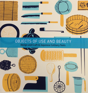
Object of Use and Beauty, Fuller Craft Museum
The design approach needs to match the content of the material as well as the purpose of the material. Is it a learning tool or a marketing tool? What type of information is the piece trying to portray? Design that reflects its content thoughtfully aids the viewer in more fully experiencing that content. The Museum of Fine Arts, Boston’s book Edward Weston: The Early Years features a matte, cream paper with soft images that totally captures the essence of Weston’s work. Glossy paper with a crisp design would have done a disservice to the content. Moreover, the Peary-MacMillan Arctic Museum chose an earth-toned, understated color palette for its poster and invitation for the exhibit Enduring Connections: Contemporary Alaskan Yup’ik and Iñupiat Art, which created a visually pleasing access point for the viewer.
I’m impressed. Where can I see these fabulous winning entries?
Competition winners will be exhibited at the 2019 Annual NEMA conference in Burlington, VT, November 6-8, 2019. Join us in the Exhibit Hall to “oooh” and “aaaah” over the gorgeous designs. You may even take inspiration from the different categories and consider submitting your museum’s work in next year’s Publication Awards!
Thank you sincerely to all the museums and historic sites across the region who submitted entries to this competition. Your design work is appreciated, valued, and important.